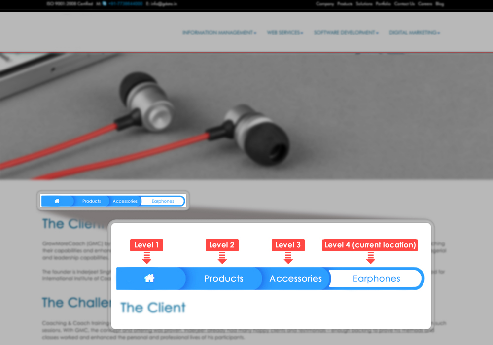
You might have heard the term ‘Breadcrumb Navigation’ and even seen it on many websites in the following manner:
Breadcrumbs serve two purposes. From a visitor’s point of view, they visually help identify exactly where on the website they are. They also help search engines like Google better index your website and make hierarchical sense of your website structure, enabling structured data and improving your site’s internal linking structure.

Breadcrumb Benefits
- Visitors take fewer steps when navigating from section to section
- Breadcrumbs clarify site navigation that shows visitors where they are on a site's hierarchy of pages without having to examine the comparatively less semantic URL structure
- Breadcrumbs use space effectively
When should you use breadcrumbs?
Breadcrumbs enhance the User Experience if you split content into sections and subsections grouped by related categories. If content on the website isn’t grouped, breadcrumbs aren’t as effective, but it usually doesn’t hurt to have them anyway.
Breadcrumb Types
Breadcrumbs can indicate a page’s position, pathway, or characteristics.
- Position: Breadcrumbs indicate each page’s position in relation to others, when a website has more than two levels of navigation
- Pathway-based breadcrumbs: These show every step of the path the user has travelled to reach his or her current destination
- Items grouped by characteristics: E-commerce sites often make use of breadcrumb to organize product categories and make it easy for users to move between categories, end products, and informational pages
Breadcrumbs and User Experience (UX)
For both mobile and desktop, breadcrumbs in websites make it easier to gauge usability. When designers do not provide a breadcrumb trail, users click on embedded links or use the back button. The web browser’s “Back” button is history-based (that is, it’s based on how the user has landed on a particular page) whereas breadcrumb links are hierarchy-based.
Example implementations of Breadcrumbs
- Apple puts breadcrumbs in their footer links area instead of just before page content
- MSDN Docs uses arrow icons, but the last link includes a drop-down menu with extra pages to encourage further browsing
- TutsPlus incorporates breadcrumbs into their blog with primary and secondary categories
Breadcrumbs and SEO
Google suggests enabling breadcrumbs to indicate a page’s position in the hierarchy of your site. Schema.org recommends using a consistent breadcrumb vocabulary for coding. Providing access to all site pages is a practice search engines favour. They lower bounce rates and add structured data by improving your website’s internal linking structure.
If your website is powered by a CMS, you’ll probably find a readymade plugin that’ll make setting up breadcrumbs a simple process. For websites that have a compelling navigation system in place, breadcrumbs enhance usability &browsing experience.


